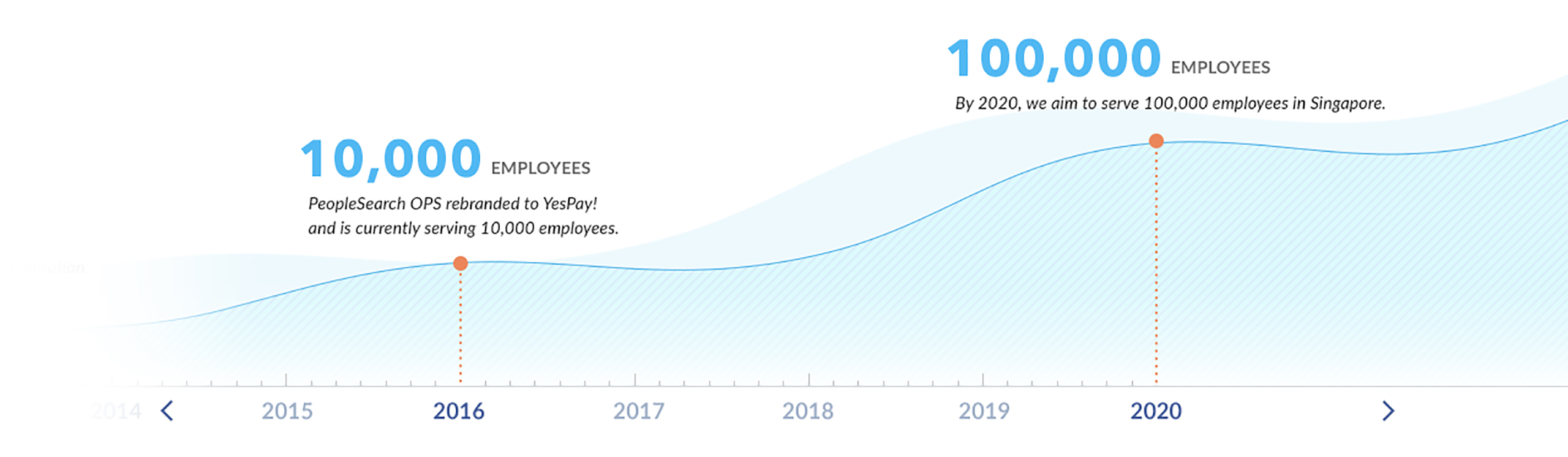


With this symbol we summarize that life is simple and gives rewards when you have a positive attitude towards it.
The logo design for YESPAY! reflects this fresh and innovative attitude that is always thinking of moving forward, solving the needs of our customers efficiently.
We add the letter "Y" for YES and mark "!" which means surprised by new things every day, color palette was used in blue tones that convey professionalism, trust, authority, power and loyalty, thus creating a brand that shows that life is full of new and positive things and YESPAY! each day has its reward.